
Quick answer
- Install BatchScroll (a Chrome extension), click its toolbar icon, then Capture a list of URLs, and paste your URLs, one per line.
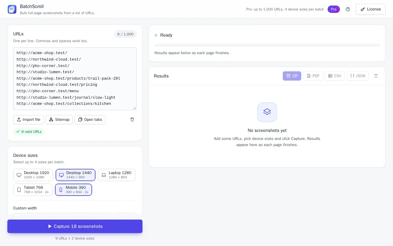
- Under Device sizes, select the widths you need: Desktop 1920, Desktop 1440, Laptop 1280, Tablet 768, Mobile 390, or a Custom width from 240 to 3840 px (Pro).
- The Free plan captures one size per batch. Pro captures up to four sizes per batch, so every URL comes back once per size.
- Click Capture N screenshots, then ZIP to download all the images plus a CSV report.
- Tablet and mobile are emulated in desktop Chrome (width, 2× pixel density, mobile user agent, touch). That's close to a phone, but it isn't Safari on a real iPhone.
Choosing a website responsive screenshot generator
Checking breakpoints, or making mobile and desktop screenshots for a client deck or portfolio, is rarely about one page. To screenshot a responsive website at three or four sizes across a dozen pages, the usual options all have a catch:
- Chrome DevTools device mode (free, built in). Open DevTools, click Toggle device toolbar (Ctrl+Shift+M, or Cmd+Shift+M on a Mac), pick a device or type a width, then choose Capture full size screenshot from the toolbar's ⋮ menu. Accurate, but one page at one size per round: 20 pages at 3 sizes is 60 rounds.
- Online responsive screenshot generators. Most take one URL at a time in a web form. A hosted service also can't open localhost or intranet pages, and needs your cookies for pages behind a login.
- Developer tools. Command-line packages and hosted scraper jobs batch well, but you write config or code.
BatchScroll sits in between: many URLs times several widths, no code. It runs in your own Chrome, so staging, localhost and pages you're signed in to work too, and nothing is uploaded.
Which widths to use
BatchScroll has five built-in screen sizes for responsive design. The height only affects the first screen and elements sized with 100vh; with Full page on, the whole page is captured either way.
| Preset | Viewport (CSS px) | Pixel density | User agent | Typical use |
|---|---|---|---|---|
| Desktop 1920 | 1920 × 1080 | 1× | Your Chrome's own | Full-HD monitors; wide heroes and max-width containers |
| Desktop 1440 | 1440 × 900 | 1× | Your Chrome's own | The default; a good all-round desktop shot for decks |
| Laptop 1280 | 1280 × 800 | 1× | Your Chrome's own | Smaller laptops, where a long desktop menu starts to crowd |
| Tablet 768 | 768 × 1024 | 2× | iPad Safari, with touch | Tablet portrait; a common breakpoint where layouts switch |
| Mobile 390 | 390 × 844 | 2× | iPhone Safari, with touch | Phones: stacked layout, menu button, tap targets |
| Custom (Pro) | 240–3840 wide, 900 tall | 1× | iPhone Safari with touch below 768 px, otherwise your Chrome's own | Your own breakpoints, such as 360, 1024 or 2560 |
A practical set for most sites is Desktop 1440, Tablet 768 and Mobile 390. Add custom widths a pixel either side of your own breakpoints, such as 767 and 769, to catch off-by-one media queries.
How to capture several sizes in one batch
- Open BatchScroll. Click the toolbar icon, then Capture a list of URLs; the app opens in a tab.
- Add your URLs. Paste them one per line, or use Import file (.txt or .csv), Open tabs or Sitemap (Pro).
- Select sizes under Device sizes. Click each size you want. On Free the card says "Free plan: one size per batch"; on Pro it says "Select up to 4 sizes per batch."
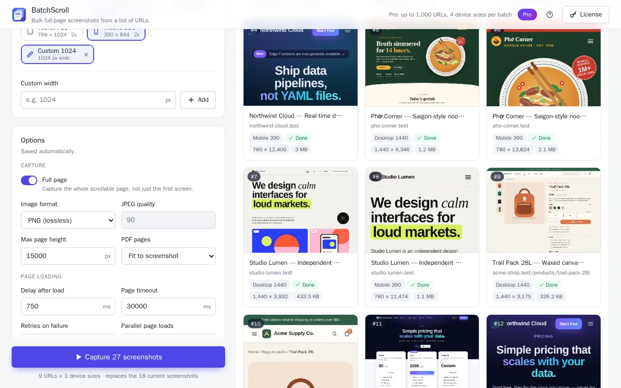
- Add a custom width (Pro). Type a number from 240 to 3840 into Custom width and click Add. It appears as a chip such as Custom 1024 and is selected automatically if a slot is free; if four sizes are already selected, unselect one to use it.
- Check the options. Keep Full page on (off captures only the first screen, faster). Turn on Scroll to load lazy content if images appear as you scroll.
- Click Capture N screenshots. N is URLs × sizes, spelled out under the button ("9 URLs × 2 device sizes"). A separate Chrome window does the capturing, and Chrome shows its "started debugging this browser" bar; closing that bar pauses the batch.
- Export. ZIP downloads every image plus
report.csv. On Pro, PDF merges the batch into one file for a client deck (made of images, so its text isn't selectable).
On the Free plan? Run the list once with Desktop 1440 and click ZIP, then run it again with Mobile 390. Download the first ZIP before the second run, because a new batch replaces the current results.
Naming files by device
Every image in the ZIP is named from a pattern. The default, on both plans, is {index}_{host}{path}_{preset}, so a two-size batch comes out in URL order:
001_yoursite.com_desktop-1440.png002_yoursite.com_mobile-390.png003_yoursite.com_pricing_desktop-1440.png004_yoursite.com_pricing_mobile-390.png
On Pro you can change it under File name pattern; a preview shows the result as you type. Two useful patterns:
{host}-{path}-{preset}givesyoursite.com_pricing-mobile-390.png: no number, page and device side by side.{preset}_{host}{path}givesmobile-390_yoursite.com_pricing.png: sorting by name groups the shots by device, ready to drop into separate slides or folders.
{preset} is the size name (tablet-768, custom-1024); {width} is just the number. The ZIP is flat, so put the token you want to sort by first.
A quick responsive QA checklist
Open the desktop and mobile images of a page side by side (there's no built-in visual diff, so this part is by eye) and look for:
- Navigation collapse. At 768 and 390 the menu should become a menu button; at 1280 it shouldn't wrap onto two lines.
- Horizontal overflow. A mobile or tablet capture that looks shrunk, as if zoomed out, usually means something is wider than the screen or the page lacks a mobile viewport tag; a phone would show the same. Content cut off at the right edge is the other symptom.
- Images. Heroes cropped oddly, images that don't scale down, and blurry images, which the 2× captures make visible.
- Sticky headers. In a full-page capture, a fixed or sticky header appears once, at the top. Check how much of the first 844 px it takes on mobile, and that full-height (
100vh) sections look right at each preset's height. - Tap targets and text. Buttons big enough to tap and not crammed together; text readable without zooming and not spilling out of buttons.
- Cookie banners and chat widgets. On a phone they can cover much of the first screen. Check them once, then turn on Hide cookie banners & chat widgets (Pro), or hide anything else with Custom CSS (Pro).
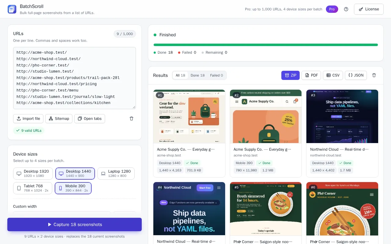
Tip: a full-page mobile screenshot is much taller than the desktop one, because the same content sits in a narrower column. Free captures pages up to 15,000 CSS px tall and Pro up to 60,000 px; anything longer is cut and marked truncated in the report.
Emulated viewport vs a real phone
For Tablet 768 and Mobile 390, BatchScroll sets the viewport size, 2× pixel density, an iPad or iPhone Safari user agent and touch input. That's the same kind of emulation as Chrome DevTools device mode, so you get the layout your media queries produce at that width.
It isn't a real phone, though. The page is still rendered by Chrome's engine on your computer, not by Safari on iOS. That means:
- Safari-only rendering bugs and CSS differences won't show up.
- System fonts come from your computer, not the phone.
- There's no browser address bar, notch or on-screen keyboard, so problems tied to those won't appear.
- Speed, memory and network are your desktop's, not a phone's.
Chrome's documentation calls device mode "a first-order approximation" of how a page looks on a mobile device (Chrome DevTools: device mode), and the same applies here. Use batch captures to find layout problems across many pages quickly, then check the most important pages on a real iPhone and Android phone.
Frequently asked questions
What sizes are included?
Desktop 1920, Desktop 1440, Laptop 1280, Tablet 768 and Mobile 390. Tablet and mobile use 2× pixel density, a mobile user agent and touch emulation. Pro adds custom widths.
Can I set custom widths?
Yes, on Pro: type 240 to 3840 px into Custom width and click Add. You can keep up to four custom widths. They use 1× density, and widths below 768 px get a mobile user agent.
How many sizes can I capture in one batch?
The Free plan captures one size per batch, for up to 25 URLs; for desktop and mobile, run the list twice. Pro captures up to four sizes per batch, custom widths included, for up to 1,000 URLs. Each URL is captured once per selected size.
Is a 390 px capture the same as an iPhone?
Not exactly. 390 px matches the CSS width of several recent iPhone models, and BatchScroll sends an iPhone Safari user agent, so the layout and breakpoints match closely. But the page is rendered by Chrome's engine on your computer at 2× density, so Safari-specific rendering, system fonts and browser bars are not reproduced. Check key pages on a real phone.
Why is the mobile image 780 px wide instead of 390?
Mobile 390 and Tablet 768 capture at 2× pixel density, like a high-density screen. The layout is still the 390 px one, but each CSS pixel becomes 2 × 2 image pixels, so the image is 780 px wide (1,536 px for Tablet 768) and text stays sharp.
What do I get on Free vs Pro?
Free: 25 URLs and one size per batch, PNG, pages up to 15,000 px, ZIP and CSV, no account needed. Pro: 1,000 URLs and four sizes per batch, custom widths, file name patterns, banner hiding, custom CSS, JPEG, merged PDF, JSON, pages up to 60,000 px and three pages in parallel.
Capture every page at every size
Paste your URLs, pick your device sizes and get every full-page screenshot in one ZIP. Free plan: 25 URLs per batch, no account needed.